Quick Start
Get CSS tokens from a Figma file within minutes.
Developer Guide - If you are a developer looking to get started pulling tokens from a Figma file, you might be looking for our Handoff CLI. That document will walk you through how to set up the CLI, and start pulling tokens into your project in an automated fashion.
Start In Figma
Starting with the Handoff Figma plugin is the easiest way to get going with Handoff and understand how everything works together. It will allow you to quickly define design decisions in your components, and preview the tokens for that component.
This is a quick video overview showing how you can use the plugin.
Get the Handoff Figma Plugin
You can install the Figma plugin by visiting our Figma community page - https://www.figma.com/community/plugin/1376124565609689822/handoff
Click Open In and choose the Figma File you want to work with.
Picking the Right Figma File
Quick Start Figma Files
You can use Handoff with any project that has defined components. For this quick start, we recommend cloning our Quick Start file. We also have a more comprehensive design system starter file, that will help with more complex patterns in Handoff. Feel free to clone a draft of either of these files and use them however you'd like, including for commercial applications.
Choose Your Own Adventure
If you'd like to use your own file, make sure you have a well-structured design system file. Handoff relies on Figma Component Sets and Variants to organize the tokens. Besides enabling Handoff features, its also considered best practices when building your Design System, you can read more here.
If you're not familiar with these concepts, we recommend starting with the Quick Start file or at least reading the concepts section.
Run the Plugin
- Open a Figma file.
- Run the Handoff plugin by clicking on the
Pluginsmenu, and selectingHandoff Figma PluginunderDevelopment. - The plugin will open in your file, with a list of all the components with variants in your project
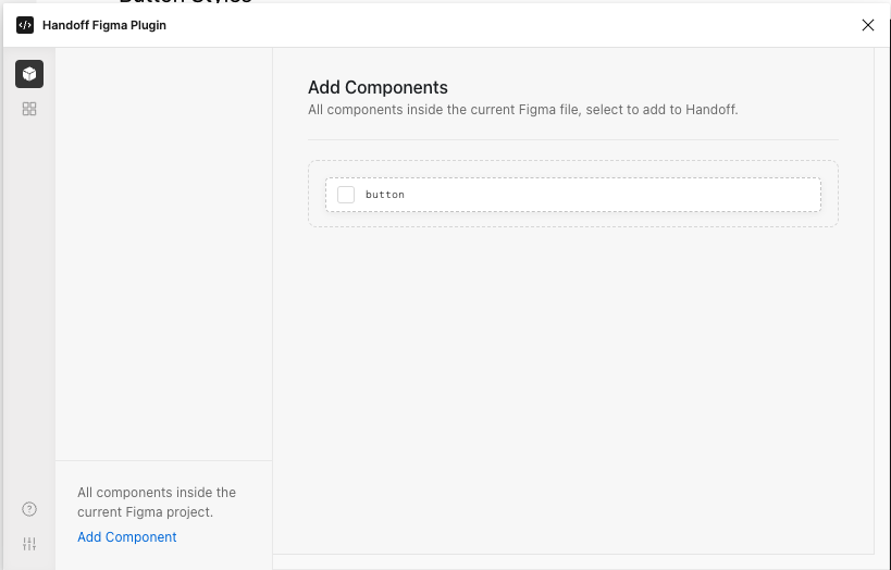
Add Your First Component Part
- Click the check box next to your component to activate it.

- When you click on Button in the tab bar, you will be able to add parts to your button.
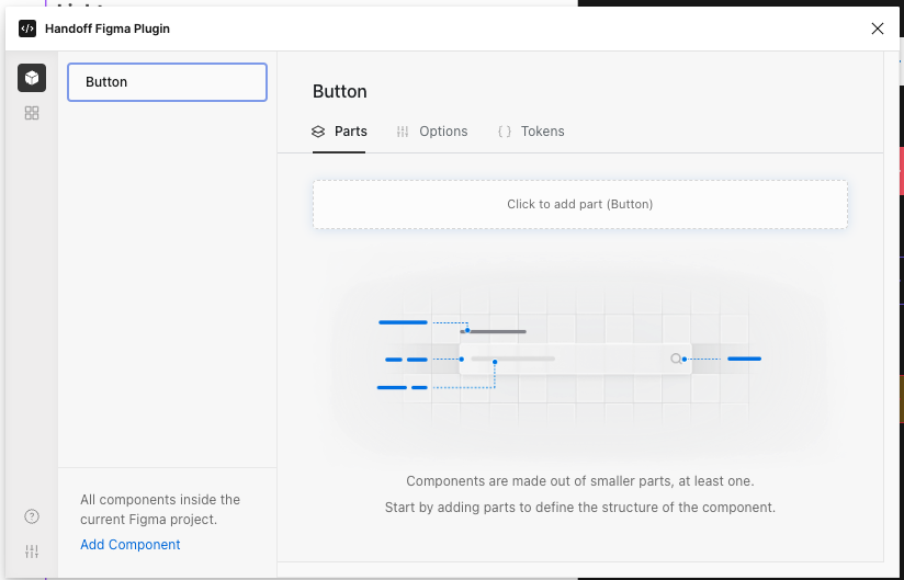
- In the Figma Layer tree, select the root part of the component. In our case,
we selected the part labeled
Structure/Button. This part wraps the other elements and provides the color, shape, and shadow of the element.
- Click the button
Click to add part. You can enter a name for this part, but we'll leave this blank for now. Hitenterto create the button.
- You've created your first part! Select each design decision
that should be exported: the background color, border color, spacing, effect (shadow) and opacity.

Configure How Tokens Are Named
You can adjust the naming structure of your tokens on the fly. Each component gives you different options depending on the variant props available to it.
Out of the box, Handoff starts with the token structure defined in the AWS Style Dictionary schema. This control allows you to override that.
- Click on the
optionstab. - Under naming structure, check off all the elements you want in your token name.
- You can also reorder by dragging the name elements around.

View your tokens
Now that you've created your first component with a part. Let's examine the resulting design tokens.
- Click on Tokens to view the generated CSS variables.
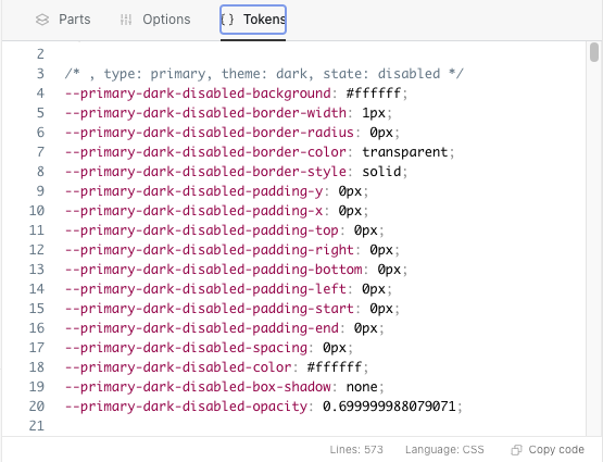
- Notice that each button variant, state, and theme has its own token group and that every design decision is exported. This is everything you'd need to style the button background in every variation.
- Since we left the part name empty, each token name consists of just
--{type}-{theme}-{state}-{property}
Add a second part
- Click on the
partstab. - Click on the
Button Textin the Layer Tree. - Click on
Click to add partin the plugin parts pane.
- Name it Label (or whatever you'd like).
- Choose the decisions to export for the label. We chose fill, typography, and effect. Notice that typography wasn't available before, but is now because this is a text layer.

- Click on the tokens tab to view your new label tokens.
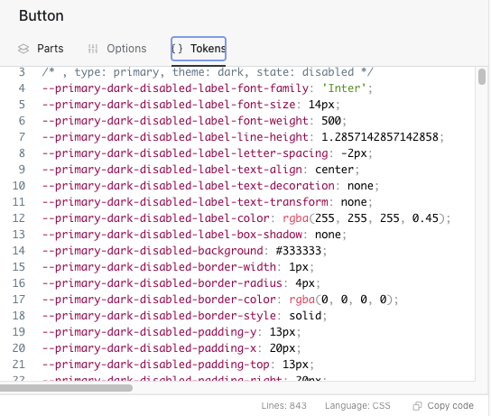
You should now see new tokens that include the fonts for each variant, state, and theme. You can see how you can vary font size, color, weight, or even family between variants in one component.
Notice how the token structure changes. The first part structure is
--{type}-{theme}-{state}-{property} but the label structure declares that part
--{type}-{theme}-{state}-disabled-{property} so that you can control how the
tokens are used and named.
You can proceed to add more parts. In our example you could define new parts for the icons, or declare a single part that describes both icons, or just use the label tokens to describe your icons.
Publish the File Library
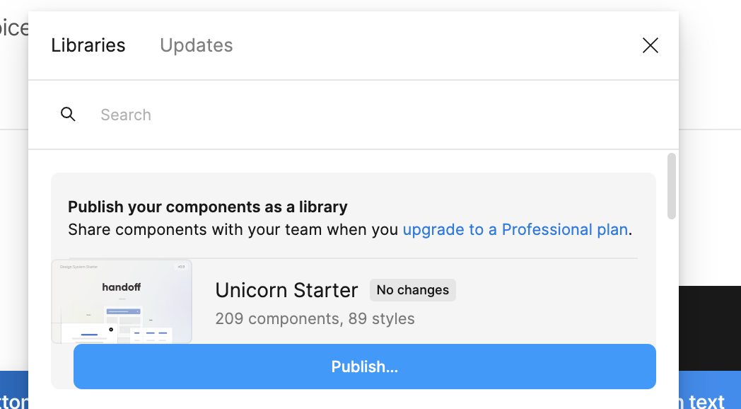
Before you can extract tokens from the Figma file, you'll need to publish the File Library. You'll need a paid Figma account to take this action.
- Click on the main menu in Figma.

- Click on libraries.
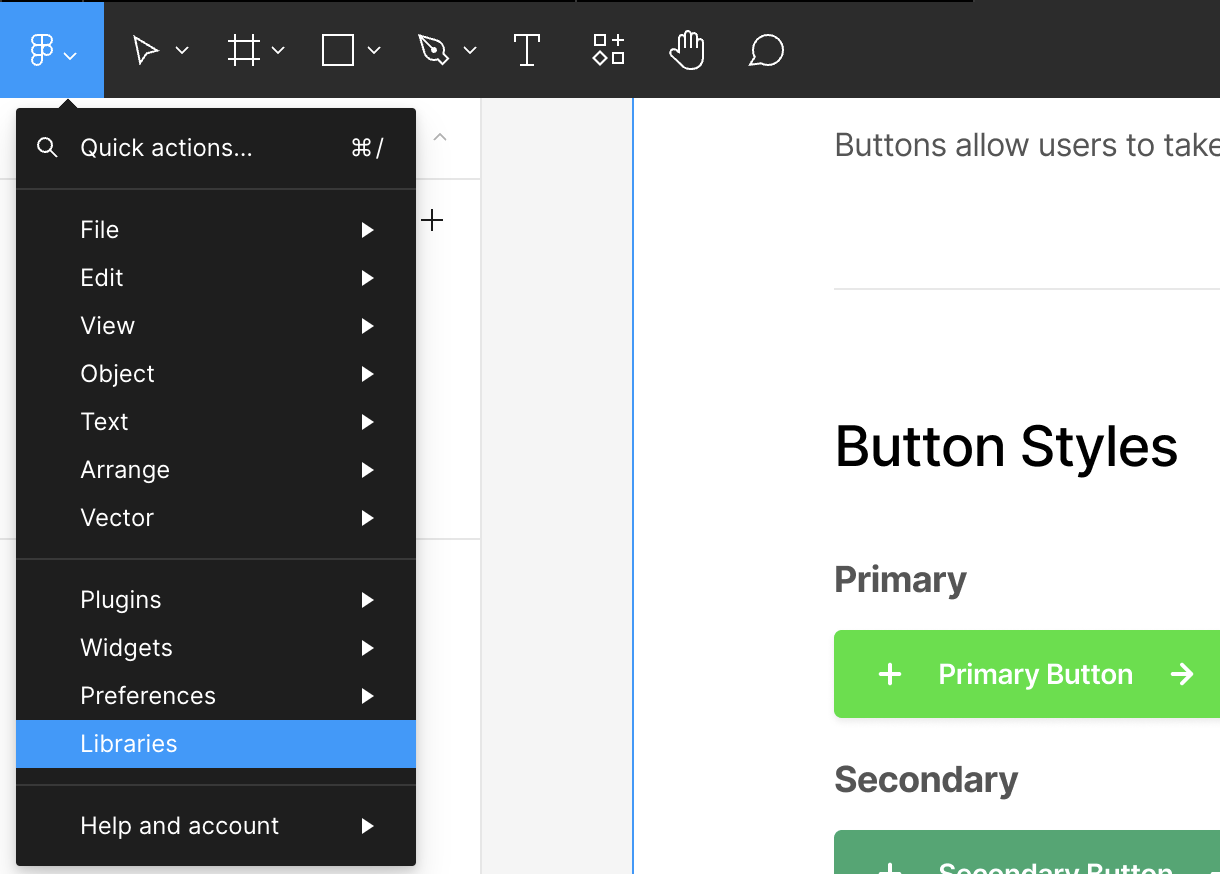
- Click on publish.
What's next
Now that your Figma file has a defined component, it’s time to export your tokens for use in your projects. Hop over to our Developer Quick Start to start integrating tokens with your code.